Somewhere in the middle of 2010 jamie d photography began an official LLC business. If you wondered what the d stands for it is my middle name initial. It was recent that I watch Lyndon go through all the steps of becoming a business and creating a brand. This was the next step for me. In the late fall I began researching designers. I found Jen from Jen Thompson Photography who created logo designs. I loved the simply and clean looks of her work. Jen’s work was consistent. I loved that she was a girl and would understand me. I loved her photography style and that she was a photographer as well as an artist!
We started in the beginning of 2011 after I completed her questionnaire. It took me time to sit down and think about my overall style, color schemes, things that I did not like, fonts and symbols. This was so good for me to form ideas in who I am and what I love. It was even better to have to write them out. This too has been a journey for me as I discover my style. I am still learning.
We started with 3 different concepts and I chose one of them. Being honest, it was not love at first sight. Here is a little side story to understand who I am a little better. When we were picking out our wedding bands I was told by the Jeweler that I was a percolator. Yes, a percolator like a french press. I need time to think and let a new idea seep in my mind. This was no different with my logo design. Then the tweaking of the logo design began. First with identifying the color scheme. Jen was patient to work with me through the whole process. She made all the LITTLE changes that made ALL the details come together into a logo design that I LOVE!
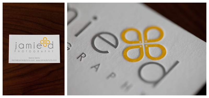
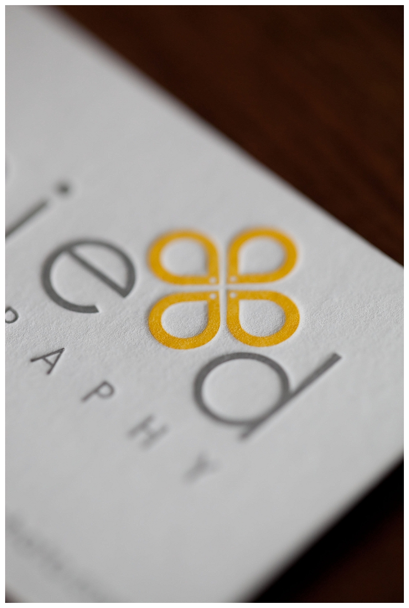
In the beginning of the logo design I was not able to articulate symbols that would describe me or symbols that I would included to represent my photography journey. In the end the icon is beyond perfect and far better then I could have described. First the icon looks like a flower. To me it is the side of hippiness that’s in me (barefeet, daises and wildflowers, green, and a vw bus!) The flower to me represents growth and life. However, inside the flower are tear drops. Tears have been a part of my journey. God, through my tears has allowed me to grow to trust that He is sovereign and that he is the one who allowed jamie d photography to be created.
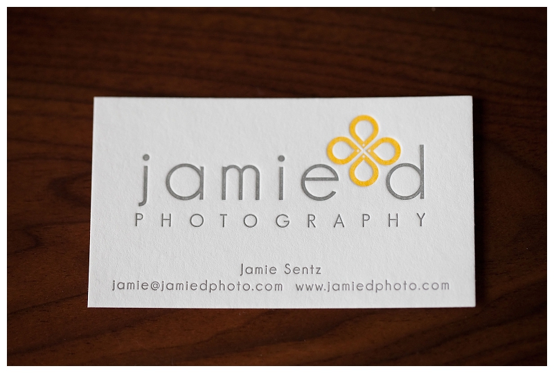
We finished the logo design and business cards several months later. Once I had all the design files I needed to find a local printer. This is when I discover Paisley Dog Press! After my first meeting with Janelle, I knew their company was perfect for printing my business cards! Organized, attention to detail, artist, and green! Also brides who are out there and want custom letter press invitations… you must check them out!
You can read part one here, part two here, part three here, and part four here. The next blog post I will share where I am now, the struggles, and what I learned from theFIX with Jasmine Star!
LOVE your logo and your business card! It is you and it is perfect!